“Color is a power which directly influences the soul.”

Red is the most important color in Maasai culture; it signifies bravery and is thought to scare away lions. It is also the color of unity for the Maasai, as it represents the cow’s blood drunk for strength and in celebrations. The red shuka is the trademark Maasai item of clothing.
This week’s assignment is to feature the color red.
Red is a vibrant, intense color. It is attention-grabbing and is often used as a warning, even in nature. It can also be described as warm and vibrant. It is commonly associated with romance and passion, and it turns out it can literally cause your heart to beat faster. Red is the color of blood, of heart, of courage, of strength. Red can also be described as angry or aggressive, and it is used in depictions of danger. Indeed, the portion of our brain involved in the “fight or flight” response is triggered by the color red. Red is bold, and a little can go a long way.
How does the color red make you feel? How do you use it in your photography?

Because it is so attention-grabbing, red can be used in our photography to draw attention. It is particularly effective when used in isolation.

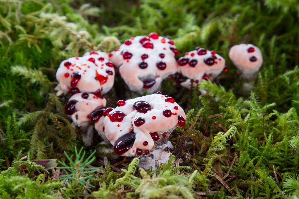
Red is a vibrant, intense color. It is attention-grabbing and is often used as a warning, even in nature. Red berries, red mushrooms, and red insects are all more likely to be poisonous.
For best results, consider these tips for post-processing your submissions for this assignment:
-
Use a calibrated monitor
-
Save files you want to share on Facebook in sRGB color space (you can select this option in Lightroom’s export menu).
-
Reds are easy to oversaturate, so be careful not to overdo saturation in post-processing. Using too much saturation can cause a loss of detail in that color. Also, remember that saturation typically increases along with contrast. The more contrast you add to an image the more color saturation there is.

Red and green are contrasting colors on the color wheel and will draw the eye when used side by side.
Your assignment this week is to show us your interpretation of red. Grab your camera and get creative! Carefully process your images and show us your best efforts in our Facebook group Muench University. Our team of pro photographers will eagerly be waiting to give you some feedback and share some of their photos to give you more ideas.
Happy Shooting!
View Post on Original Blog
https://muenchworkshops.com/blog/assignment-3-the-color-red
